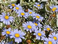
I had someone at work tell me that I must have been in a "blue" mood since I didn't make it to round two of the BOTB14. Not really. I just found these two pieces in a cigar box filled with cameos I'd bought from who know whom who knows when. I might have gotten these from eBay, or from a bead store, or they might have been gifts from someone. I just can't remember. But on the day I found them it was rainy outside and possibly that is what triggered my Muse to pull them out of the box and take them upstairs to put on my Bead tray. I also tried crystal chain as a component. It was tricky as I had to actually cut the chain and on one of the necklace I was a tad bit short, but I think I made it work out. I also used a few of the wooden rondelles I'd gotten from Byantium all those years back. I've never been able to find these any place else and I do indeed hoard them all. The light blue pieces of glass I got at 1Stop Bead Shop during a trunk sale. They'd brought them back from the latest Bead and Button Show. The Rivoli, I found also in a box of items. And the silver beads were left overs from the class I took from Amy Katz.
I have to say that I really am not a fan of blue. I rarely work with blue. I don't know why as it is a very popular color, but not actually one of my favorite colors. My Father loved blue. My Mother loves blue. And when I use to teach at Byzantium, I'd always make more blue kits than any other color as most people like the color blue. I wondered what the color blue says about a person's personality and about their experiences. I did a little search and came across a website about color psychology. Interesting ideas about the color blue. So in essences using the color blue doesn't mean you actually are blue in spirit. It has so many more meanings that are positive and reaffirming.
http://www.empower-yourself-with-color-psychology.com
The Color Blue
The color blue is the color of trust and responsibility
This
color is one of trust, honesty and loyalty. It is sincere, reserved
and quiet, and doesn't like to make a fuss or draw attention. It hates
confrontation, and likes to do things in its own way.
From a color psychology perspective,
blue is reliable and responsible. This color exhibits an inner security
and confidence. You can rely on it to take control and do the right
thing in difficult times. It has a need for order and direction in its
life, including its living and work spaces.
This is a color that seeks peace and
tranquility above everything else, promoting both physical and mental
relaxation. It
reduces stress, creating a sense of calmness, relaxation and order - we
certainly feel a sense of calm if we lie on our backs and look into a
bright blue cloudless sky. It slows the metabolism. The paler the blue
the more freedom we feel.
In the
meaning of colors, blue relates to one-to-one communication, especially
communication using the voice - speaking the truth through verbal
self-expression - it is the teacher, the public speaker.
The
color blue is idealistic, enhancing self-expression and our ability to
communicate our needs and wants. It inspires higher ideals.
Blue's wisdom comes from its higher level of intelligence, a spiritual perspective.
Blue is the color of the spirit, devotion and religious study. It enhances
contemplation and prayer. On the other hand, blue's devotion can be to
any cause or concept it believes in, including devotion to family or
work.

Blue
is conservative and predictable, a safe and non-threatening color, and
the most universally liked color of all, probably because it is safe and
non-threatening. At the same time blue is persistent and determined to
succeed in whichever endeavors it pursues.
Change
is difficult for blue. It is inflexible and when faced with a new or
different idea, it considers it, analyzes it, thinks it over slowly and
then tries to make it fit its own acceptable version of reality.
Blue
is nostalgic. It is a color that lives in the past, relating
everything in the present and the future to experiences in the past.


